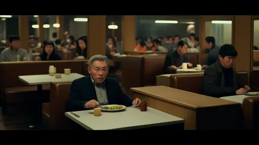
In the world of culinary arts, the visual presentation of a dish is as crucial as its flavor profile. Among the many elements that contribute to visual appeal, the concepts of color contrast and negative space stand out for their profound psychological impact on diners. These elements are not merely decorative; they shape perception, evoke emotions, and enhance the overall dining experience in ways that are both subtle and powerful.
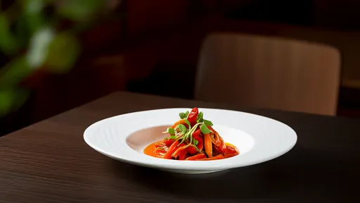
Color contrast in plating is a dynamic tool that chefs use to create visual interest and guide the eye. When vibrant hues are juxtaposed against muted backgrounds, the dish becomes a canvas where each component tells a story. For instance, the bright red of a beetroot puree against a pale, creamy sauce doesn’t just look striking—it triggers an emotional response. Humans are naturally drawn to high-contrast visuals, a trait rooted in our evolutionary need to detect ripe fruit or potential dangers in our environment. On the plate, this translates to heightened anticipation and excitement. A study in the field of gastrophysics suggests that contrasting colors can make flavors seem more intense, as the brain associates visual vibrancy with freshness and potency. A dish with poor color harmony, on the other hand, might be perceived as bland or unappetizing, even if the taste is exquisite. Thus, mastering color contrast is akin to a painter selecting a palette—it sets the mood before the first bite is taken.
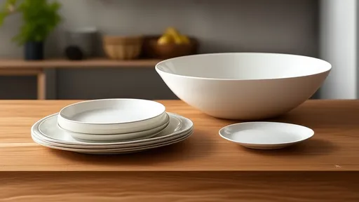
Beyond color, the strategic use of negative space—often referred to as "white space" in design—plays an equally vital role in plating psychology. Negative space is the empty area around and between elements on the plate. It is not wasted space; rather, it provides breathing room for the eye, allowing the diner to focus on the key components without feeling overwhelmed. In a culture where abundance is often equated with generosity, it might seem counterintuitive to leave parts of a plate bare. However, minimalism in plating speaks to sophistication and intentionality. It suggests that every element has been carefully considered and placed with purpose. Psychologically, negative space reduces cognitive load, making the dish easier to process and appreciate. It evokes a sense of calm and elegance, much like the serene composition of a Japanese Zen garden. When a plate is overcrowded, the diner may feel rushed or confused, detracting from the enjoyment of the meal. By embracing negative space, chefs create a visual rhythm that enhances mindfulness and appreciation for each ingredient.
The interplay between color contrast and negative space is where plating becomes an art form. Imagine a dish featuring seared salmon with a vivid green herb oil and a drizzle of golden saffron sauce. The colors pop against the neutral tone of the plate, and the strategic gaps between components allow each to shine individually while contributing to a cohesive whole. This balance is psychological alchemy: the contrast captures attention and stimulates appetite, while the negative space provides clarity and elegance. Diners are not just eating; they are engaging in a multisensory experience where sight sets the stage for taste. Research in neurogastronomy has shown that such visual cues can actually alter flavor perception, making sweet things taste sweeter or savory elements more umami-rich. The plate becomes a narrative, and the chef, the storyteller.
Moreover, the psychological effects of these elements extend beyond the individual dish to the overall dining ambiance. In high-end restaurants, where presentation is paramount, the use of color and space on the plate often mirrors the establishment’s aesthetic—whether it’s modern and minimalist or rustic and abundant. This consistency helps build a brand identity that diners remember and associate with quality. Even in home cooking, applying these principles can transform a simple meal into something special. It’s about creating moments of delight through visual harmony, something that resonates deeply in an era where dining is increasingly shared on social media. A beautifully plated dish is not just food; it’s a photograph, a memory, and an expression of care.
In conclusion, the visual weight of plating, driven by color contrast and negative space, is far from superficial. It taps into fundamental aspects of human psychology, from our innate attraction to contrast to our need for visual clarity. These elements work together to elevate dining from mere consumption to an experiential journey. As the culinary world continues to evolve, the understanding of how we see food will remain as important as how we taste it, reminding us that we eat first with our eyes.
By /Aug 29, 2025

By /Aug 29, 2025

By /Aug 29, 2025

By /Aug 29, 2025
By /Aug 29, 2025

By /Aug 29, 2025

By /Aug 29, 2025
By /Aug 29, 2025

By /Aug 29, 2025
By /Aug 29, 2025

By /Aug 29, 2025
By /Aug 29, 2025

By /Aug 29, 2025

By /Aug 29, 2025
By /Aug 29, 2025

By /Aug 29, 2025

By /Aug 29, 2025

By /Aug 29, 2025

By /Aug 29, 2025

By /Aug 29, 2025
